Integration & Consulting
Help you move, operate, innovate and thrive within the Microsoft clouds.
Technology
Explore the full list of technologies that our expert consultants can support.
Business Needs
Departmental solutions to ensure cloud and technology enablement across every area of your business.
Licensing
Experts in Microsoft cloud licensing and optimizing costs for your business.
MazikCare
Embrace patient-centered, collaborative care with our suite of real-time health solutions.
Care Path
Care Provider Link
Care Supply
Payer Matrix
Data Fusion
EmPerform
Provide people managers with flexible employee performance management software.
ShopFloor
Empower production managers with cutting-edge manufacturing process management.
Velocity Insights
Monitor, analyze, and prioritize .NET, JavaScript or Node JS errors – all on one dashboard.
PowerGov
Engage citizens with a community development app for city maintenance and management.
Azure Management Services
Deliver on your cloud strategy with a team that continuously monitors, improves, and optimizes your Azure environment.
Digital Workplace Program
Optimize Microsoft 365 security, usage and user adoption with our digital workplace experts.
AI Operations Services
Support for your AI technologies & ongoing strategic coaching to take your AI initiatives to the next level.
App Dev Program
Ongoing enhancements, app security, DevOps and reporting for apps running in Azure.
Managed IT Security
Take a proactive, continuous approach to optimizing your security environment and strategy.
Data & Analytics Program
Operational support for running, monitoring and managing services for the Azure Data Platform.
Managed Detection & Response
Get around-the-clock threat monitoring, detection, and rapid response to security breaches.
Dynamics Program
Ensure the health of your Dynamics environments, optimize usage and encourage user adoption.
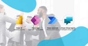
Power Platform Program
Get an extension of your team that ensures the health of your Power Platform.
Microsoft Support Services
Flexible, routine support and environment management for critical Microsoft systems.
Back
Search
Back