I have been spending some quality time working with the new SquaredUp Azure solution and I ran into an area of the product that is extremely powerful but appears to be less than fully documented. This blog post will showcase three different configurations that I have been using to make the Logs (Grid) view more intuitive (Bar chart for values, health state by text, Health state by value).
Creating a dashboard
In SquaredUp Azure you can easily connect to Azure and run queries from sources such as Log Analytics. These are accessible by adding a new tile and choosing Logs (as shown below).
For this example, I am using Logs (Grid).
Within this view (as with others) you define the scope, timeframe, workspace, the query (for Logs type), and the grid columns and grid options. After spending some quality time working on this (and bugging SquaredUp’s excellent technical support team), I have realized that the grid column functionality is extremely powerful! Instead of showing data just as text, you can use the grid column functionality to display as a bar chart, or an icon indicating health, or to change colors of the text in the field.
To configure this first create your visualization and the go-to grid columns. In Grid columns, you can use the {}’s to set the specific code you want for that column,
Bar chart for values:
Below is a simple Logs (Grid) with only text in the various columns:
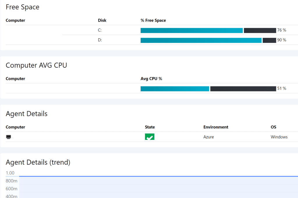
While the above provides the information, it is not as intuitive as this example where the % Free Space field was configured to display as a bar chart using this code:
<img alt="Embedded Image"src="data:image/png;base64,iVBORw0KGgoAAAANSUhEUgAAAacAAAAZCAMAAACihhEbAAAAAXNSR0IArs4c6QAAAARnQU1BAACxjwv8YQUAAADMUExURQCPpwCPqACPqQCQqQCQqgCRqgCRqwCSqwCSrACTrACTrQCUrgCVrwCUrwCVsACWsACWsQCXsQCXsgCYsgCYswCZswCZtACZtQCatQCatgCbtgCbtwCctwCcuACduACduQCeugCfuwCeuwCfvACgvACgvQChvQChvgCivgCivwCjvwCjwACkwQCjwQCkwgClwgClwwCmwwCmxACnxACnxQCoxgCoxQCoxwCpxwCpyACqyACqyQCryQCrygCsygCsywCtzACUrQCtywCeuR0ryowAAAAJcEhZcwAADsMAAA7DAcdvqGQAAAJCSURBVGhD7ZXbVhpREAUH1BiTeCEqCiK5GIwmgIoiSIiS+P//ZHWfnpmzZsiah8hbV31Cre6dJDWo19Zqa3WEddxYD77ZQNjEt5sIW/hONN6LxgdxG2EHd3cQ9rCxF/zYQNjHg32Ew4NmUDlqHovQwrbYardO2upJB0876mkXP4nGZ9H4In5FOMNvZwg9PO8Fv58jXODlBcIP/CkafXHQV4b9q/7VEOEab67F0Y06usW70d0twjh4P4bJeCpOpvCAs+nsQfw1Q5jj7znCIz6JxkJcJAmFQqW4EUgj6VNqtIXwB5c0Uii0rJEUopEUihtZpUIjqVRo1F7aqLviRgaFyo1AGkmhuNF9KKSNtJAYNwJpNJ9JoUKjR4S/GBoJ4Z6s1H+22g6tDEpZKyllrUKphnYSrZV2OgyltFPz+CiUohWd2pB2ylqBtuqGUs+4pJVS3eryH60GUSu9Jm0lndJWhWuSVopek6GdJtE9yTWlrbRUVaskqYevV8sa2dfTn8fXKzV69Z8X35N1MtJ7CpWsU7inTnRP2kkbPUeNrFLWCKVRD0r3JBqlexqErzeUTqWfZ51AO2X3pBdlnezrKXpP2kl/nnXSRlTKfp5WSn9efk++T75Pvk9m3Mj3yfcpbeT7lN9T2sn3qfj78nvyffJ9MrSR4fvk+1TdyvfJ98n3CX2f8ntabSPD98n3qbqV75Pvk+8T+j7l97TaRobvk+9TdSvfJ98n3yf0fcrvabWNDN8n36fqVr5Pvk++T/gq+7RYvAAy+UTDp8jJTAAAAABJRU5ErkJggg==" width={{value*4}} height=15 /> <img alt="Embedded Image" src="data:image/png;base64,iVBORw0KGgoAAAANSUhEUgAAAO4AAAAZCAMAAAABp+KxAAAAAXNSR0IArs4c6QAAAARnQU1BAACxjwv8YQUAAABFUExURSwxNy0xNywxNi0xNi0yNy4yOC0yOC4zOC4zOS8zOS80OS80OjA0OjA1OjA1OzE1OzE2OzE2PDI2PDI3PDI3PTM3PTM4PmYWE4sAAAAJcEhZcwAADsMAAA7DAcdvqGQAAAE3SURBVFhH7dNLcoQwDARQmMGAAWM+Ge5/1LQk2wiSmiTrSF3N/hXuqqofyLN+NHVdNyquaVGV1rWdO9Mjvus7n9P7fqD6gepHysAdJsooCZQpjPOUElJwEVm4y7xSIjeuC5JuQ3d8P3I2dMdX3Qs97qGrKjCfVyZVpXVN55xioh1RC1OohVmoQKKjUAOVmSEzhTrPIRYqMdErk6knc9dUYu5sTHcAq5DEFCpd+ruUG7tFmXtllz98stMf/gsbec+OwpY/TOyY2XTbV/YK6Y19+8PEpr97DdNUNJGZmijM/Ig5ieiZ+ItHrInqEQvx8og3AG/Enx7xC9Vn27Xtcmy7iWnbPdm23cz85hHbdm27hWjbpbPtytl2NRGx7QrbtivMN4/YtjvbdgvRtmvbte3adun+1XaP4xMyMh9m2isL3gAAAABJRU5ErkJggg==" width={{(100-value)*4}} height=15 /> {{value}} %Here are the same Logs (Grid) with a bar chart for the % Free Space field.
Health state by text:
Below is an example of how you can show health state with a graphical indication of the state of the object. Below is the code used to display the health state (the State field shown in the graphic below):
{{#if (value == ‘Healthy’)}}<img src=’https://demo.squaredup.com/images/healthy.png’>{{elseif (value == ‘Potentially Overallocated’)}}<img src=’https://demo.squaredup.com/images/warning.png’>{{else}}<img src=’https://demo.squaredup.com/images/critical.png’>{{/if}}
Health state by value:
You can also set the health state by a value (such as % CPU, or free space, or memory). This was provided in a previous blog post. The code below makes that possible, and that code is followed by a sample output for it.
{{#if value < 20}}<i style=”color:red;”>{{value}}</i>{{elseif value >= 20 && value <=40 }}<i style=”color:yellow;”>{{value}}</i>{{elseif value > 40 }}<i style=”color:green;”>{{value}}</i>{{/if}}
I found another example online in a discussion thread related to this question (Need Mustache Examples to apply custom formating – Question & Answer – Community Answers (squaredup.com)).
{{#if displayName.toLowerCase() == 'server1.domain.com'}} srv01 {{elseif displayName.toLowerCase() == 'server2.domain.com'}} srv02 {{elseif displayName.toLowerCase() == 'server3.domain.com'}} srv03 {{else}} {{displayName}} {{/if}}I owe a huge thank-you to the support team at SquaredUp for the samples that they have provided me which are the code examples in this blog post. If you have different samples, please reply with a comment let me know so we can continue to make this functionality even more useful!

;)


