Solutions were a part of OMS and available within Log Analytics that provided pre-built visualizations for data in Log Analytics. These were moved into Azure Monitor a while back (Monitoring solutions in Azure Monitor – Azure Monitor | Microsoft Docs). Since that point in time, Microsoft has shifted focus towards Insights and Workbooks. It appears that solutions are on the way to being deprecated as part of this directional shift. There are a lot of good solutions that currently exist, so how do we move these solutions into a workbook?
It would be nice if there was a way to right-click on a workbook and export it or automatically convert it to a workbook. There is however no such functionality available now. This blog post shows the process that I used to convert an existing solution into a workbook using the “DNS Analytics (preview)” solution as an example. For this blog post, I am working from this assumption: if there is currently no data in a view that the view does not need to be translated into the new workbook.
Screenshots
Start with screenshots of each of the views currently available in the solution. While we may not be able to exactly match these visualizations, having pre-populated versions available for reference is invaluable when re-creating visualizations. Below are the screenshots from the DNS Analytics solution.
Overview tile:
Drilling into the overview tile:
Get to the queries
In the examples above you can drill into the underlying queries by using the “See all…” button or clicking on a specific record shown in the view. Below are some of the queries which were found drilling in this way with names added to the top of the query.
DNS security
DnsEvents
| where SubType == ‘LookupQuery’ and isnotempty(MaliciousIP)
| summarize Attempts = count() by ClientIP
Domains Queried
DnsEvents
| where SubType == ‘LookupQuery’
| summarize Count = count() by Name
DNS Clients
DnsEvents
| where SubType == ‘LookupQuery’
| summarize QueryCount = count() by ClientIP
| where QueryCount > 1000
Dynamic DNS Registration
DnsEvents
| where SubType == ‘DynamicRegistration’ and Result =~ ‘Failure’ and isnotempty(IPAddresses)
| summarize FailureCount = count() by Name, IPAddresses
Name Registration Queries
DnsEvents
| where SubType == ‘DynamicRegistration’
| extend failureCount = iif(Result == ‘Failure’, 1, 0)
| summarize sum(failureCount), totalCount = count() by ClientIP
List of DNS Servers
DnsInventory
| where SubType == ‘Server’
| project Computer, DomainName, ForestName, ServerIPs
List of DNS Zones
DnsInventory
| where SubType == ‘Zone’
| project ZoneName, DynamicUpdate, NameServers, DnsSecSigned
Unused Resource Records
DnsInventory
| where SubType == ‘ResourceRecord’ and ResourceRecordName !in ((DnsEvents
| where SubType == ‘LookupQuery’
| distinct Name))
DNS Servers Query Load
Perf
| where CounterName == ‘Total Query Received/sec’
| summarize AggregatedValue = count() by bin(TimeGenerated, 1h)
| render timechart
DNS Zones Query Load
Perf
| where ObjectName == ‘DDIZone’
| summarize AggregatedValue = count() by bin(TimeGenerated, 1h), CounterName
| render timechart
Configuration Events
DnsEvents
| where SubType == ‘ConfigurationChange’
| project EventId, TimeGenerated, Computer, TaskCategory, Message
DNS Analytical Log
DnsEvents
| where SubType == ‘LookupQuery’
Building the workbook
From the Log Analytics workspace, create a new workbook (“DNS Analytics” in this example). Add the query as shown below and run the query.
For each workbook section, use the name for the step name, and chart title and match the value for the no data message to what was shown in the solution (No data found in this example).
Lather, rinse and repeat for each of the queries identified above. For each visualization, steps may be required to configure a chart to represent the data and/or to configure specific ways to visualize that data.
As an example, I ended up tweaking one of the queries to show success and failures for DNS queries to this result.
DnsEvents
| where SubType == ‘DynamicRegistration’
| extend failureCount = iif(Result == ‘Failure’, 1, 0)
| extend successCount = iif(Result == ‘Success’, 1, 0)
| project Failure = failureCount, Success = successCount, ClientIP, bin(TimeGenerated,1h)
To generate this result:
Finishing up the workbook
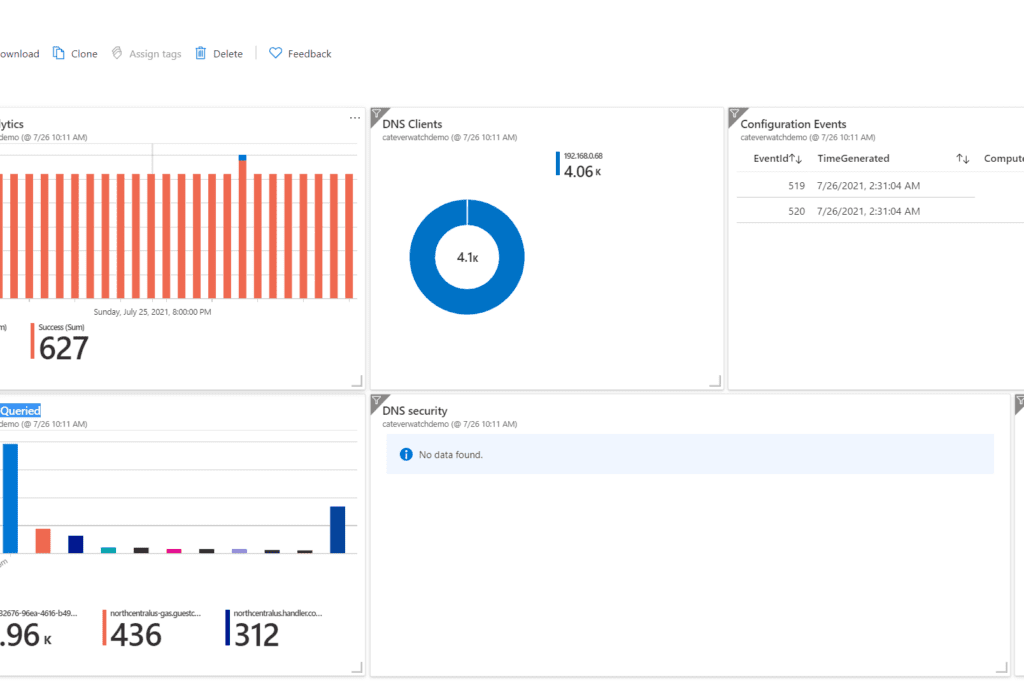
After determining where the various workbook components need to go, what size to display them, and such we end up with a workbook such as the one shown below.
Pin to a dashboard
The various workbook visualizations can then be pinned onto an Azure dashboard as shown below:
Summary: While there is not an automated process to re-create solutions in workbooks and dashboards, the process used in the blog post was pretty straightforward and the results appear to be very similar to what was provided by the original solution.

;)


